City Cycles: UX research and product design
Role: Product designer, UX researcher
Programs: Figma, InVision, Google Forms
I completed this case study analysis for a professional User Experience (UX) research project through the course of my continued education in UX Design. City Cycles is a hypothetical bike rental company that serves both locals and tourists alike. I was provided with an existing website for City Cycles to begin my research, along with information to conduct competitive analysis.
City Cycles wanted to improve the online reservation process for booking bicycles through their website. They noticed that customers weren’t using the existing website to book, and their staff were instead handling calls for booking over the phone.
In-person user interviews I conducted showed that users were frustrated by the website: they found it difficult to find what they were looking for, and they were unsure of how to fully complete their reservation online. Bounce rates from the City Cycles reservation page supported this hypothesis.
I used user surveys, user interviews, and analytics data to capture both qualitative and quantitative data.
Based upon the results I discovered, I recommended the following:
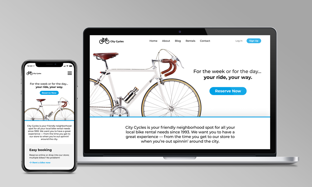
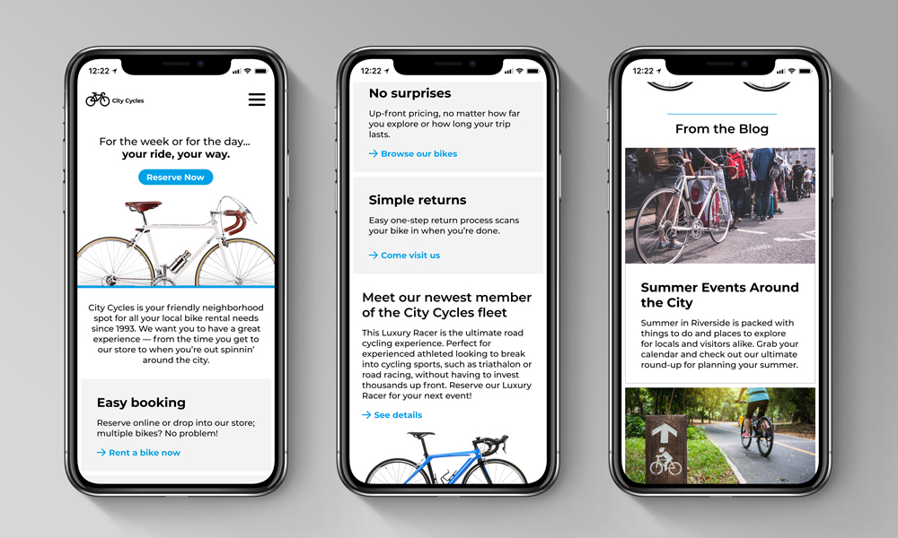
- Add a front-and-center call to action for reserving bicycles on the homepage that’s impossible to miss.
- Rework the menu on the homepage so information is logically organized and users can easily navigate/find what they need.
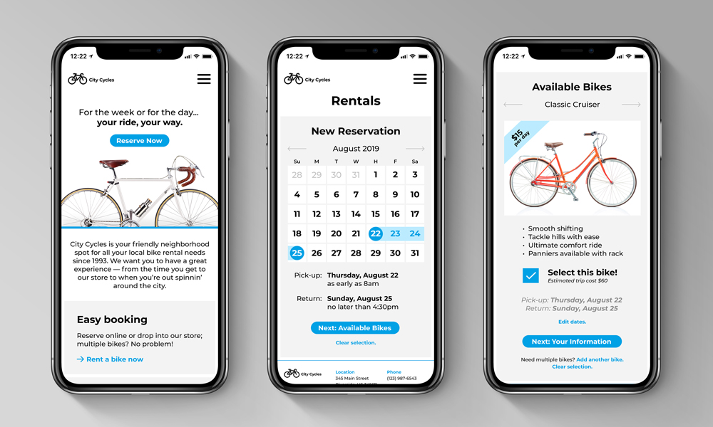
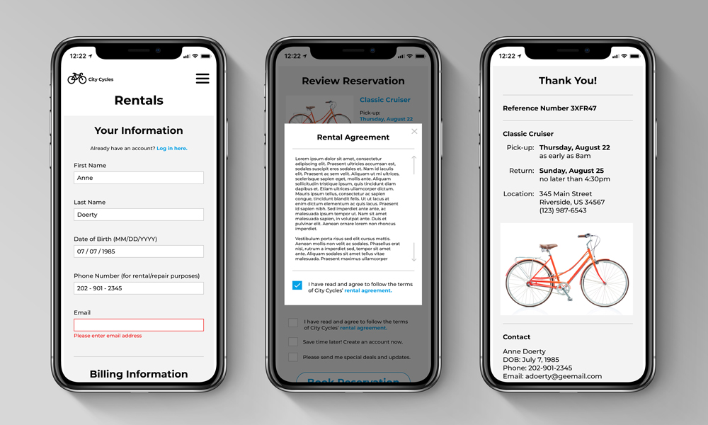
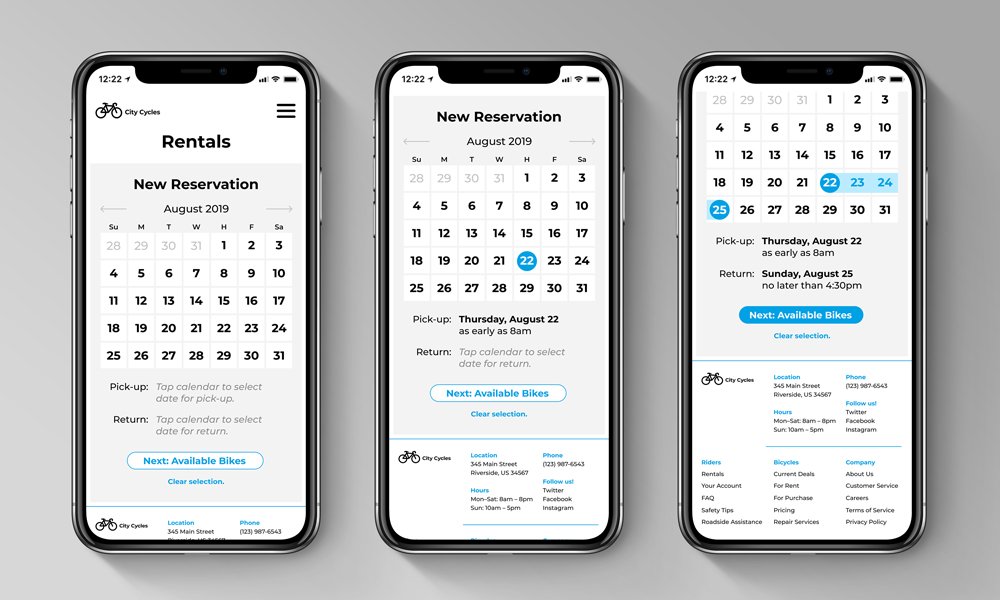
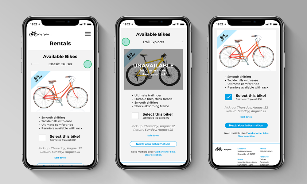
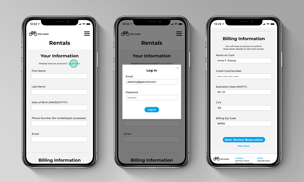
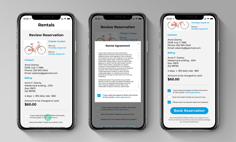
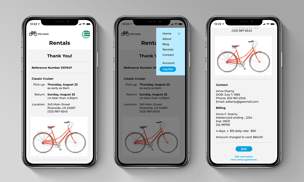
- Create a streamlined reservation process: select date/time, select bike/view pricing, enter payment information, double check details/book, receive clear confirmation of reservation.
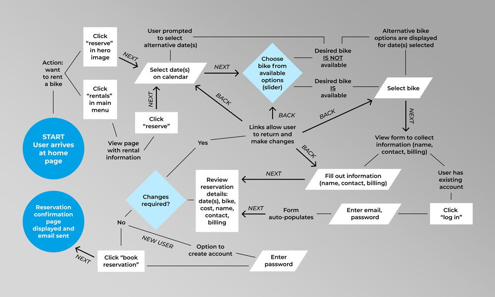
For the second stage of the project, I examined site navigation and information architecture by creating journey maps, sitemaps, wireframes, and low-fidelity prototypes to propose and test my solutions. I created user personas to help empathize with users and to aid in selecting real-world users for testing that closely matched City Cycles’s potential customers.
Finally, I created a high-fidelity prototype of the mobile site and conducted another round of user testing, validating my proposed solutions; still screens of each step can be viewed below the journey map project image. This limited prototype enabled a tight focus on the scope of work while taking the least amount of design time to complete before testing. The next steps in this process would be to follow up on KPIs—reservations, correct page views—if this were a real-world client, followed by additional A/B testing and iteration as necessary.